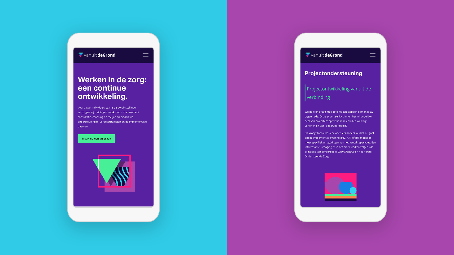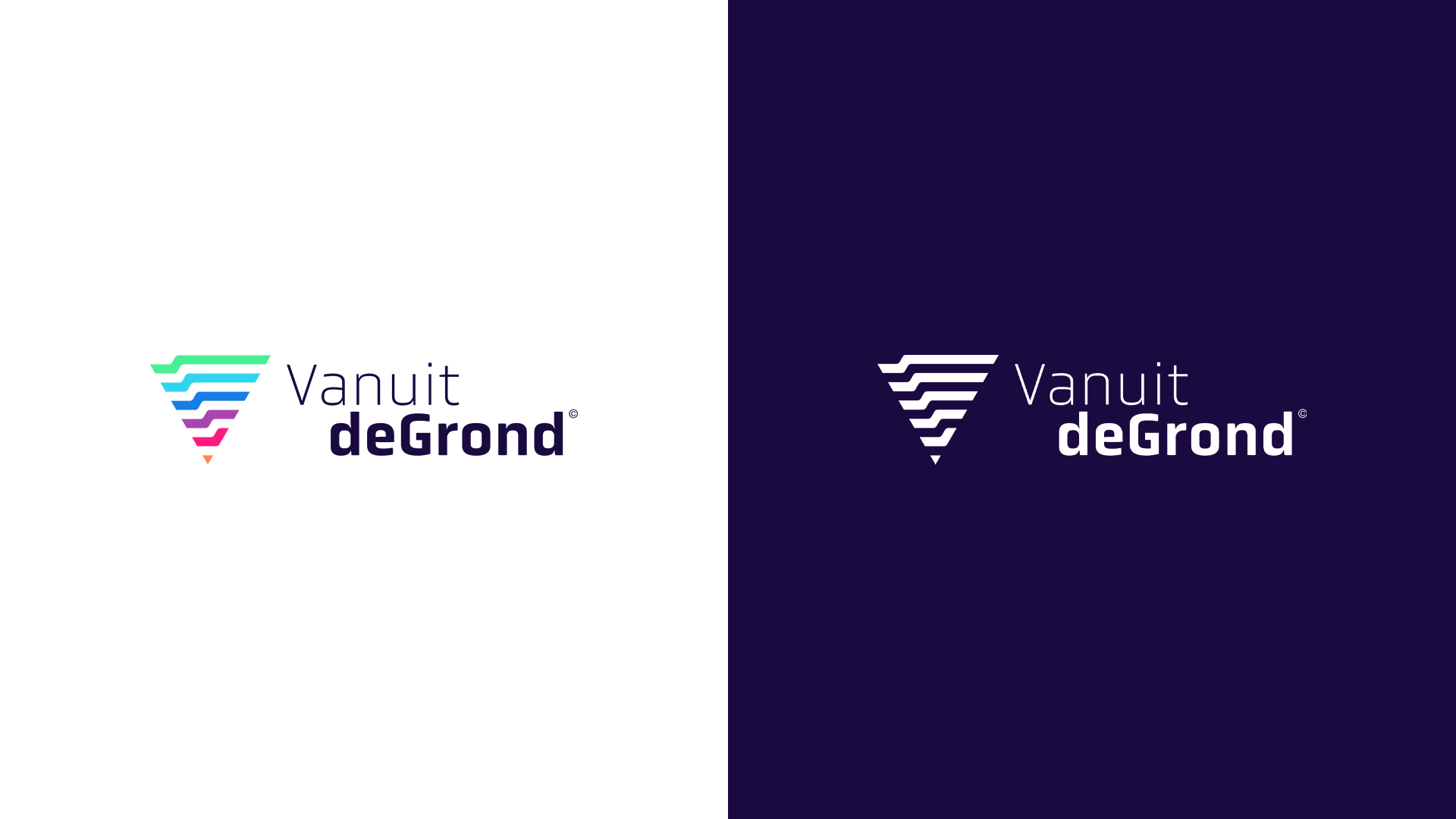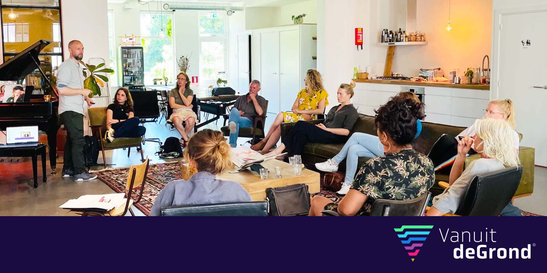
VanuitdeGrond (Dutch: "from the ground up") specializes in coaching and training for psychiatric clinics and organizations.
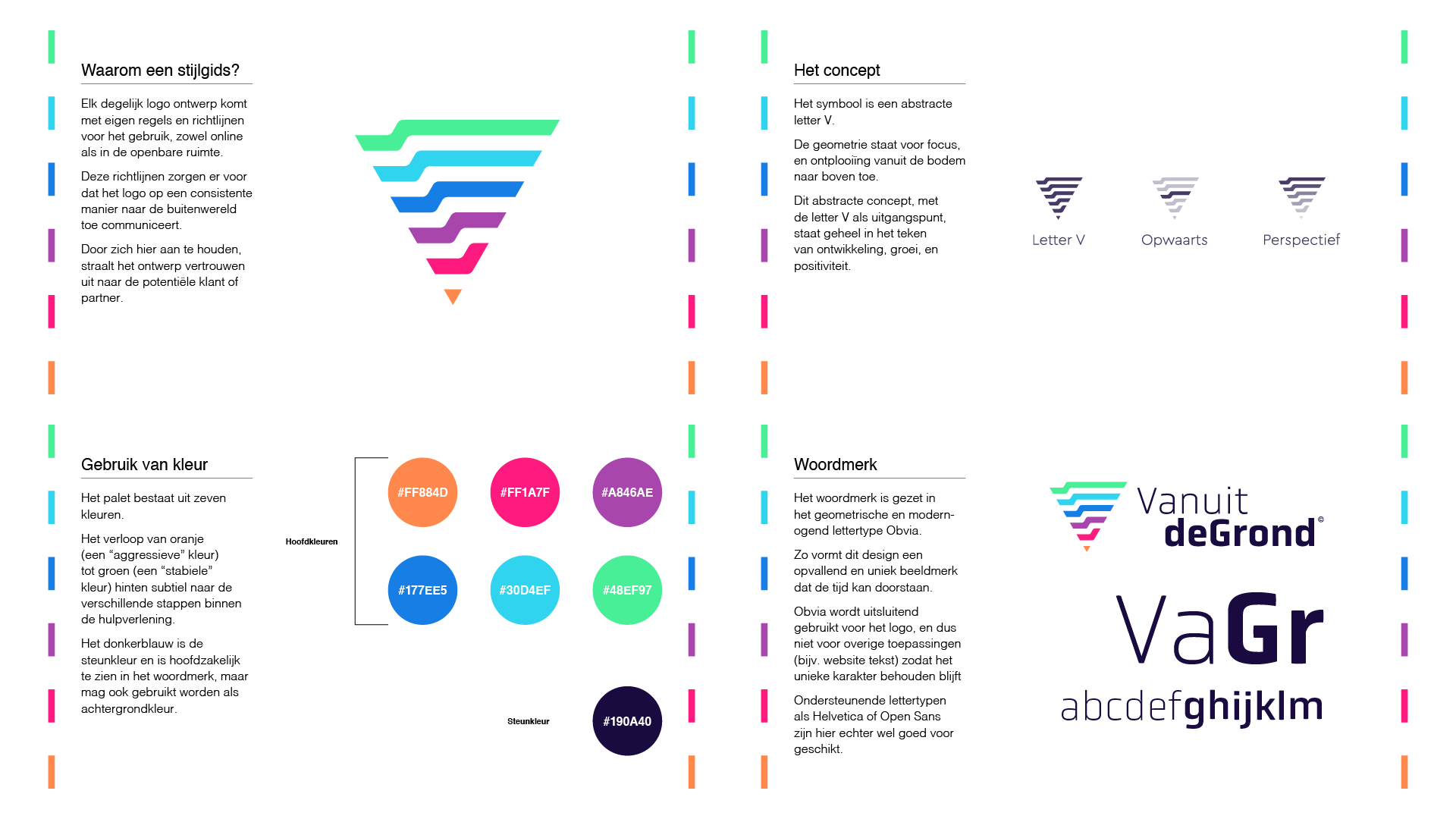
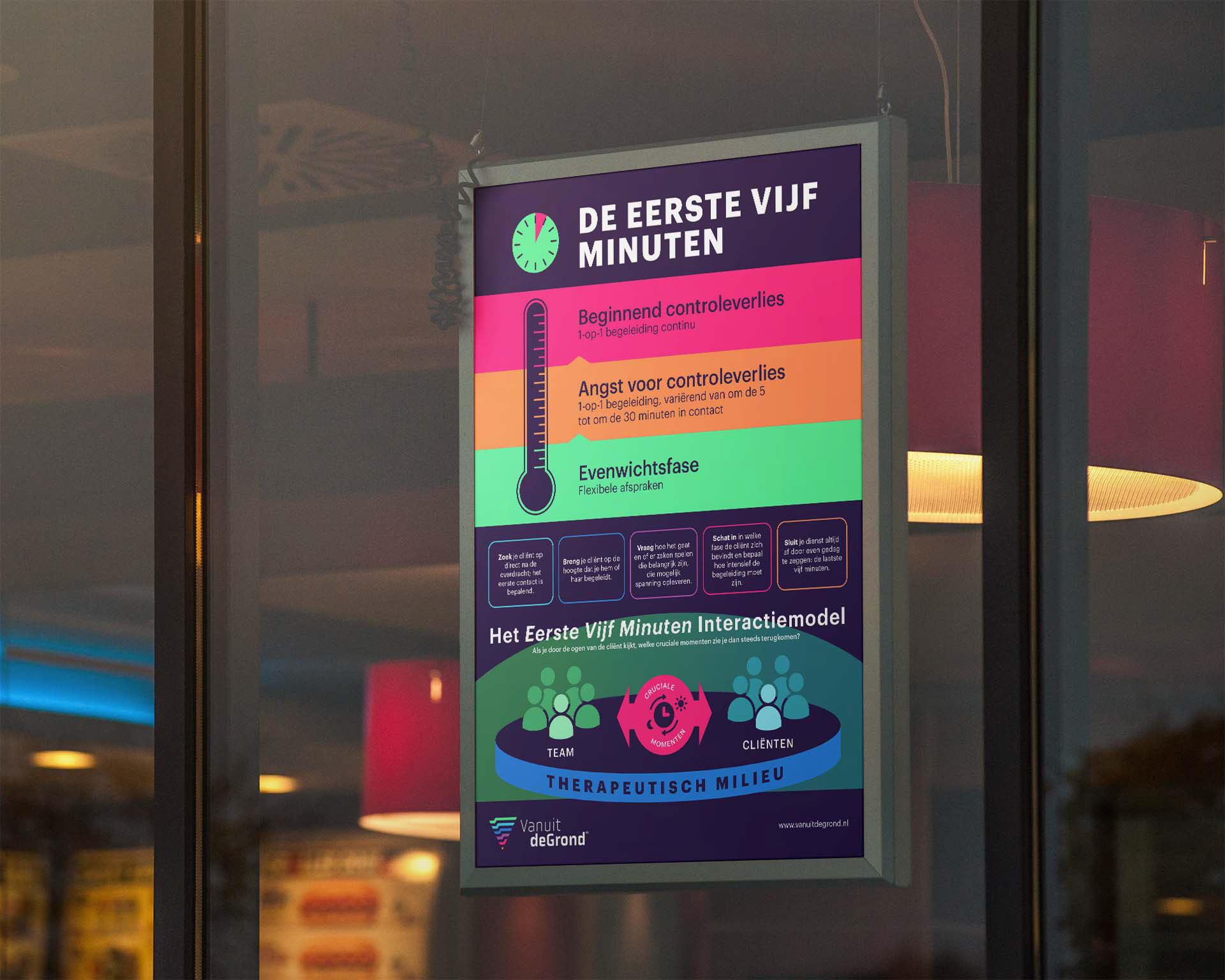
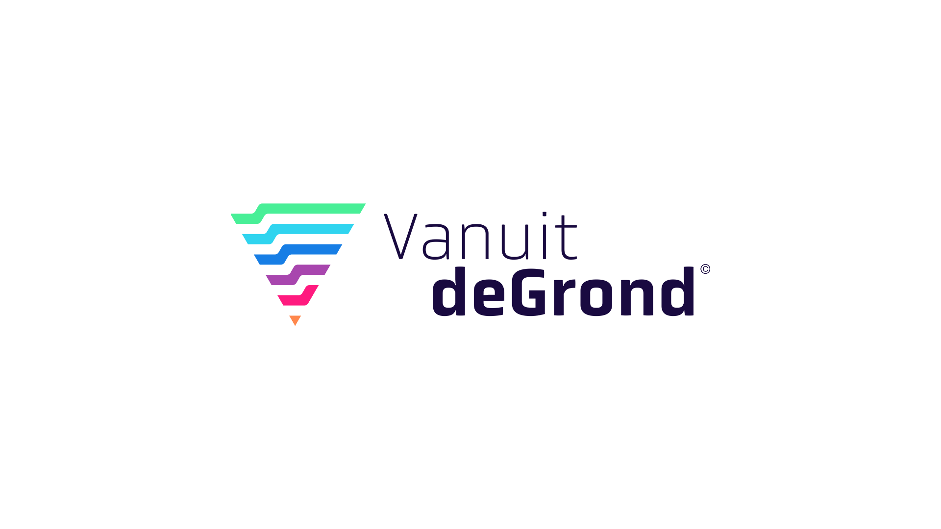
The branding starts with a logo that symbolizes different aspects in the field of psychology: the geometric V-shape shape implies 'focus', with a narrow starting point at the bottom that achieves development, growth and positivity towards the broader top of the abstract letter V.
Use of color supports this idea as well: the bottom has warmer colors to imply more intense emotional states, while the top is green and tranquil.
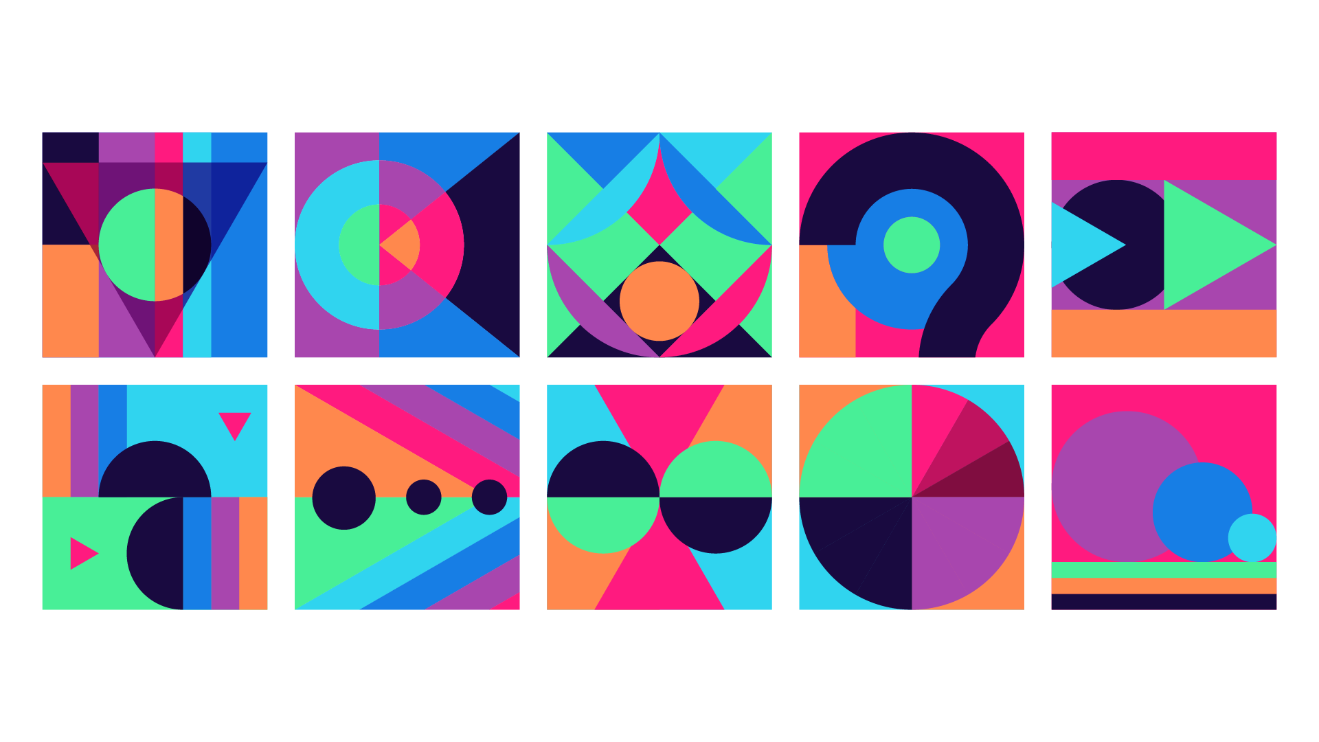
The website was built to be a radical departure from what is usually associated with the sober look of the mental health disciplines. This allowed for a bold and playful design that demands attention.